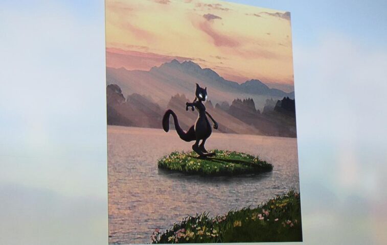
Niantic describes lessons from precursor game Ingress, hints of new Go features.
SAN FRANCISCO—The Game Developers Conference has always offered dedicated panels and stages for the biggest mobile games of the moment, so it was no surprise that Pokémon Go, which didn’t even exist last March, made an appearance. The game’s single panel at this year’s event may not have been ripe with tell-alls and behind-the-scenes looks at its every facet, but it still proved a solid look at the phenomenon’s early stages.
- Niantic says this was the very first piece of concept art for Pokémon Go.
- The first prototype of the game’s map interface, which includes GBA-styled icons and more “grassy” zones in cities.
- Day and night cycles were worked on but ultimately scaled back for the launched game.
- Day/night data was originally more pronounced in non-AR battle scenes.
- This “hologram” version of a player avatar was ultimately scrapped.
- This thumb heat map was used internally to finalize how menus would work for one-handed smartphone players.
Niantic Visual Design Director Dennis Hwang was on hand to recall the successes of the developer’s prior augmented-reality game, Ingress. That included thousands-strong user meetups organized by players themselves, along with users posting GPS-tracked walks to Ingress points of interest (and saying they lost weight as a result of all that walking). “Our goals initially were modest,” Hwang said. “If [our players] just walked a few extra blocks, we would have been totally happy, because we knew how hard it was to motivate someone to get off a chair and move due to some app or game.”
When it came time to apply Ingress’ real-world systems to a Pokémon game, Niantic had a few goals: make each player a hero, widen the game’s appeal to more ages and types of players, and overcome the issue of cognitive dissonance. Meaning: build a game experience that makes players feel like a Pokémon trainer without having them look down at their screen, then back up at the real world, and feel like the two are too weirdly disconnected.
This first manifested in Pokémon Go’s development because Niantic was worried that average smartphones would struggle to render complicated 3D scenes. How would the game work so that it felt like players were capturing a monster in a real-life location, even on low-end phones? The first idea was to use 360-degree “photospheres,” which would appear based on where the player was. However, Hwang said that characters were hard to accurately and consistently render inside of these photospheres, often appearing too big or too small compared to the scene—especially since these photospheres didn’t come with scaling metadata and were often generated from user-submitted images. (Niantic says Ingress fed the company roughly 10 million locations to use in Pokémon Go.)
Hwang didn’t describe exactly how the developer pulled off its augmented-reality, camera-powered, “monster existing in the real world” system, but he did show the very first prototype of its use: in a developer’s back yard, capturing a Pikachu. Even in that early stage, players were expected to use a single finger to flick a Pokéball at an occasionally dodging monster in the real world. In that early stage, however, sprites from the series’ Game Boy Advance games were used in lists and menus, as opposed to icons of the game’s 3D-rendered characters.
The art team then turned its attention to the game’s map, which translates real-world mapping data into a Pokémon-ized overworld. Originally, the design process leaned toward greener and more lush designs by default, to better resemble the artistic style of the series’ biggest portable hits. However, cognitive dissonance quickly emerged in real-world playtesting. Hwang pointed out that the nearby intersection of Fourth and Folson in San Francisco, which mostly consists of pavement and buildings, would look weird “painted with lush vegetation.”
Lighting engine: Taking out two Pidgeys with one Onyx
- Lighting recommendations for Pokémon Go.
- Internal documents about how various characters would look compared to each other.
- Granular look at shaders and other numerical development data.
For similar reasons, earlier “avatar” characters that looked just like characters from Game Boy Advance games were scrapped in favor of a humanoid style unique to Niantic’s version of the Pokéverse. Hwang didn’t connect some of the design dots about humans compared to monsters, but the biggest thing they have in common is a lighting engine that favors “amorphous, even lighting.” This had the double benefit of having characters pop on any background generated by smartphone cameras and also requiring fewer shader passes to reduce GPU overhead on low-powered smartphones.
For his conclusion, Hwang began hinting at features and updates coming to the app (even though the panel spoke very little about the game’s mechanics). He had two major hints: features that would tie into massive real-world gatherings of people (as in, over 1,000 Go players in the same real-world spot) and “continuing to increase a real-world connection with the player” in the form of day/night effects and weather effects in the game experience.
“There were so many ideas we wanted to build that we didn’t have time for,” Hwang said. “The version of Go that ended up going out to the public contained 10 percent of the ideas Niantic development members had.”


Leave a Reply